
Admin Statistics
The Statistics page gives platform admins an overview of how much the whole QAnswer instance is being used: totals for the period you pick, a chart of any one of them over time, and the sign-ins behind them.
From the Admin Panel, click Statistics in the sidebar to open the dashboard.

Date range and refresh
The date range at the top right is what every figure on the page answers for — the overview cards, the Global Statistics chart and the Active Users card alike. Picking a range only takes effect once both ends are set.
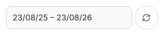
- The page opens on the trailing twelve months, ending today.
- Clearing the field reports all recorded history instead.
- The refresh button beside it reloads every section using the range currently set.
The selected range is kept in the page URL, so reloading the page — or sending the link to a colleague — opens on the same period rather than back on the default.
Overview cards
Four cards report platform-wide totals for the selected period, so each one answers the same question the chart below it does:
- Conversations
- AI Assistants
- Messages
- Users
The badge on a card is that period's total measured against everything that had accumulated before the period began — hover it to see "Growth over the selected period".
A card drops its badge when there is nothing to measure against: either the measure's own history only begins inside the period, or the date field has been cleared, in which case the report already covers all history and has no earlier level to open on.
Global Statistics chart
The card below the overview cards charts one measure at a time. The large figure under the title is that measure's total for the selected period.
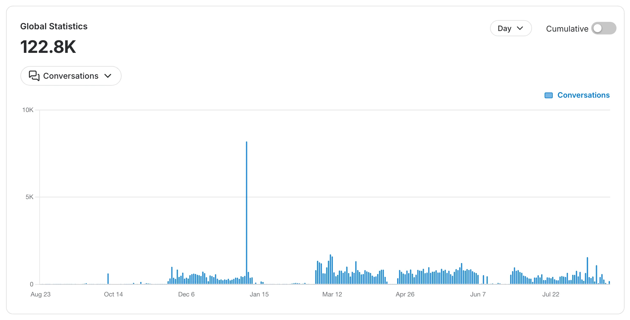
Use the metric selector to choose which of the four measures the chart plots.

The Day / Month / Year control buckets the bars by day, month or year. It changes how the period is drawn, never how much it contains — the figure above the chart stays the same whichever you pick.
Cumulative
By default the chart shows what each period added, as bars. Turn Cumulative on to plot a running total as a line instead.
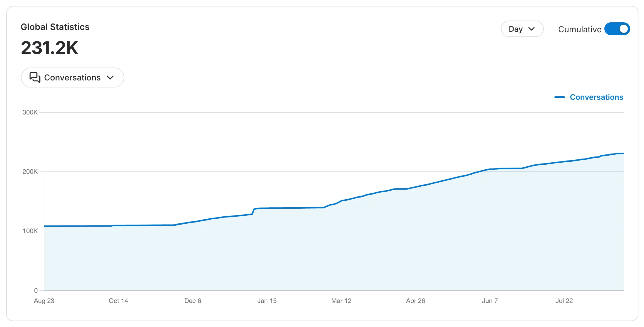
The platform-wide running total keeps its absolute baseline: the line opens on everything that happened before the period and ends on the instance's total to date, which is why it reads higher than the period's own figure.
Active Users
The last card counts successful sign-ins across the platform over time, so you can see engagement rather than just the size of the account list.
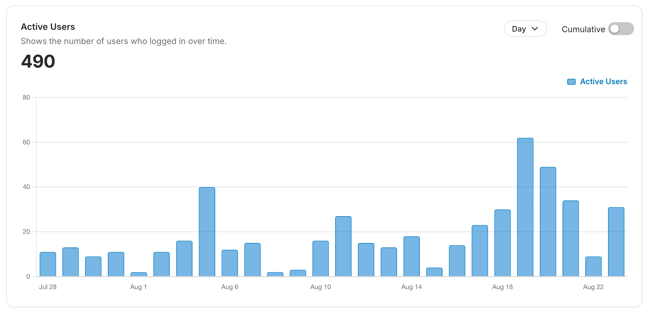
It carries its own granularity and Cumulative controls, independent of the chart above it — switching one leaves the other alone.